
Tea Shrub is a premium Sri Lankan tea brand that brings the finest, high-quality teas to the international market. The project involved a full branding experience, including logo design, packaging, and a user-centric eCommerce website built on the Magento platform. Our goal was to create a sophisticated and engaging brand identity that reflects the luxury, freshness, and authenticity of Tea Shrub’s premium tea offerings.
The challenge was to craft a visual identity that seamlessly communicates the elegance and quality of Tea Shrub while ensuring strong shelf visibility and a distinctive online presence. The logo, packaging, and website needed to align with international standards, emphasizing the brand’s Sri Lankan heritage and its commitment to delivering premium tea experiences worldwide.
The Tea Shrub logo was designed to embody luxury and freshness, using refined typography and a symbolic tea leaf motif. The metallic pastel tones add a touch of sophistication, reinforcing the premium nature of the brand while ensuring instant recognition in the competitive tea market.
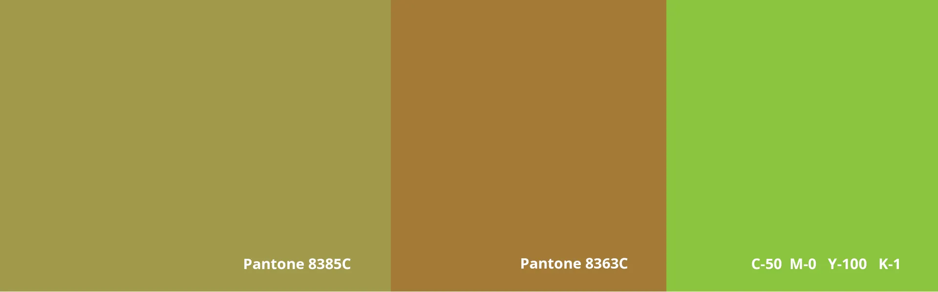
Teashrub’s branding epitomizes elegance and nature with a carefully curated color palette featuring olive green, metallic green, and black accents. Olive green symbolizes the freshness of Sri Lankan tea, while metallic green adds a touch of sophistication. These hues, combined with selected metallic pastels, create a premium luxury feel for the brand. Consistently applied across all brand touchpoints, this palette reinforces Teashrub's premium positioning and visual appeal. The typography choice balances modernity with tradition, preserving the brand’s heritage while appealing to contemporary consumers. This cohesive and captivating identity ensures Teashrub stands out in the market.
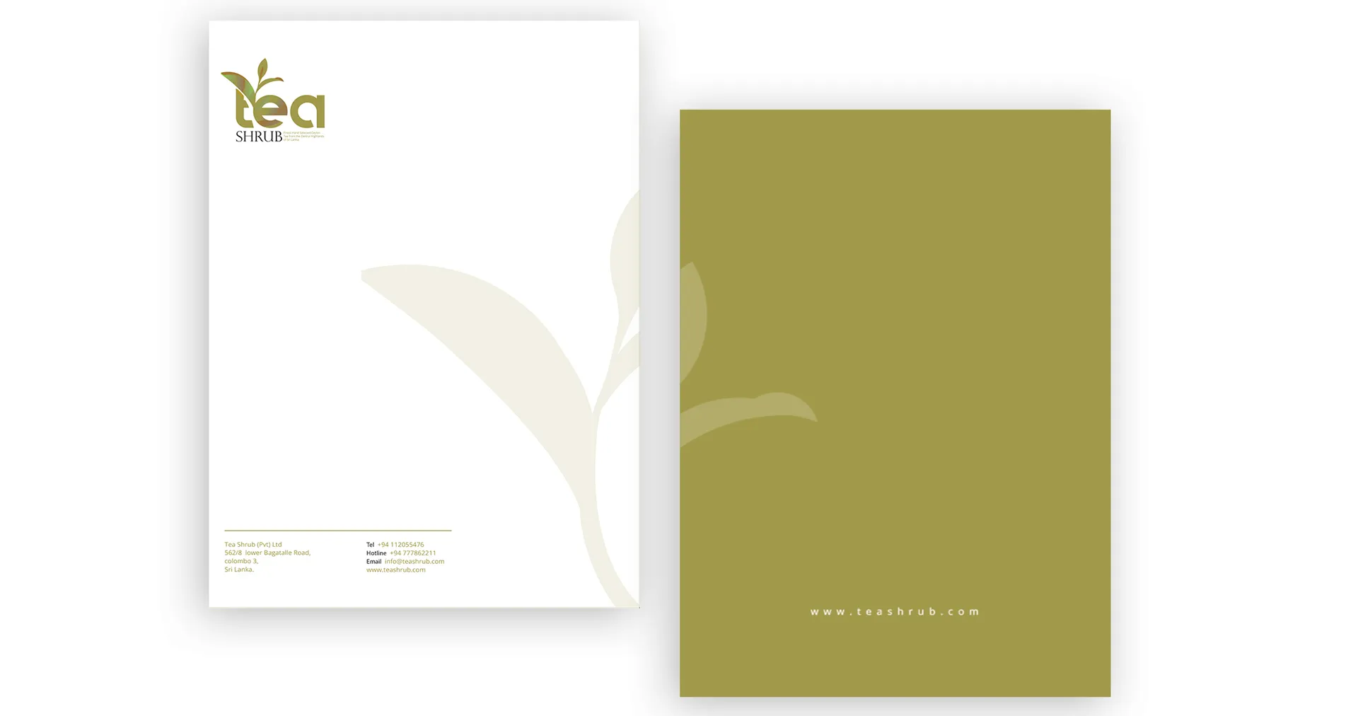
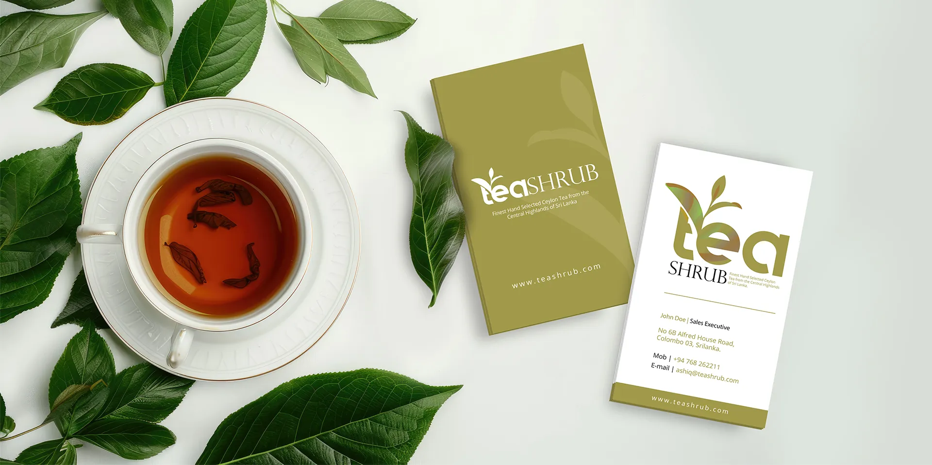
Beyond the logo and packaging, the branding extended to a full suite of stationery and marketing materials, ensuring a consistent and premium identity across all touchpoints. This included:
Business Cards: Elegant, metallic-accented designs that reinforce the luxury aesthetic. Letterheads & Envelopes: professionally designed corporate materials maintaining the brand’s refined identity.
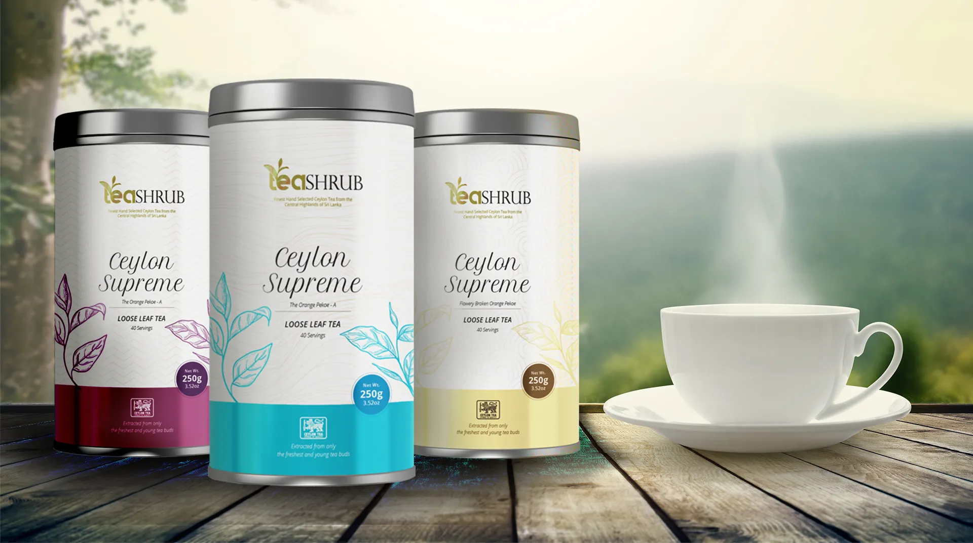
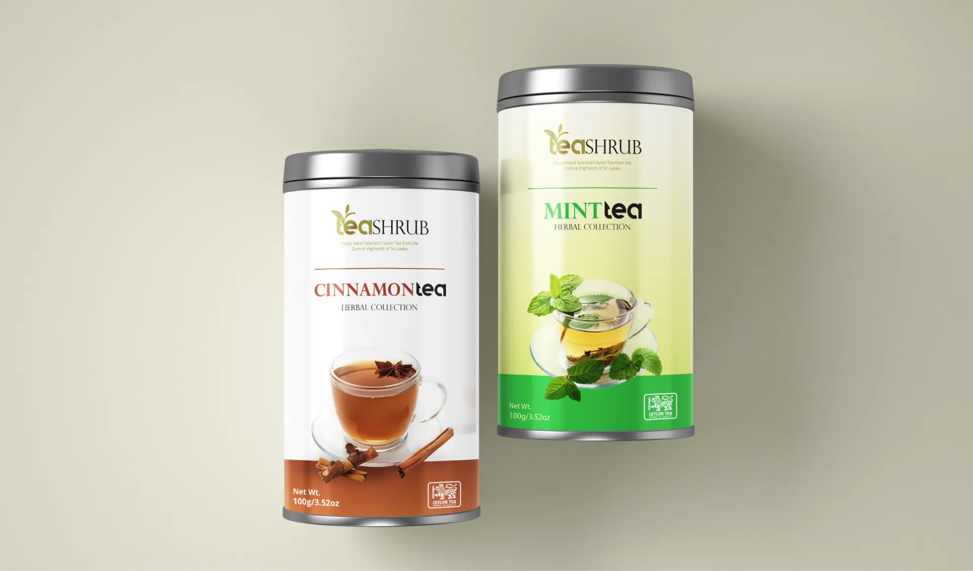
Tea Shrub’s packaging was meticulously designed to balance aesthetics with functionality, ensuring that each product not only looks stunning but also serves its practical purposes effectively. Our approach was centered around creating packaging that captivates and engages customers while maintaining a high level of practicality.
The packaging design for Tea Shrub is a testament to the brand's commitment to excellence, combining beauty and functionality to create a memorable and engaging consumer experience. By focusing on shelf visibility, flavor differentiation, and premium appeal, the packaging ensures that Tea Shrub products stand out and make a lasting impression.
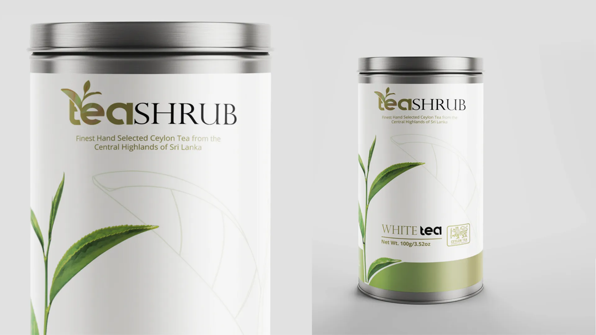
Shelf Visibility: The packaging design ensures that Tea Shrub products stand out in retail environments. Bold and visually appealing elements are incorporated to capture the attention of customers, making it easy for the products to be noticed among competitors on the shelves. Flavor Differentiation: Each tea variant has a unique look and feel, creating a distinct visual identity while maintaining overall brand consistency. This approach allows customers to easily identify their favorite flavors at a glance while also experiencing the cohesive aesthetic that defines the Tea Shrub brand.
Tea Shrub’s cohesive branding and packaging have significantly elevated its market presence, leading to stronger brand identity and higher user engagement. The visually rich website and seamless eCommerce experience boosted sales and repeat purchases, while the well-optimized site and robust branding expanded Tea Shrub's global reach. This project has successfully captured the essence of luxury and tradition, establishing Tea Shrub as a distinguished name in the global tea market with a premium digital and physical presence.