

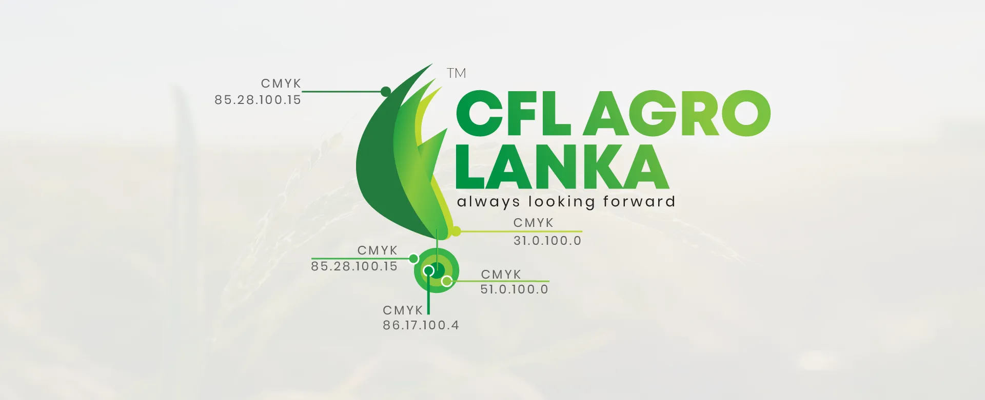
The new logo draws inspiration from the rice plant, a symbol of growth, prosperity, and sustenance. Shades of green were carefully blended to evoke qualities of freshness, reliability, and nature. The logo perfectly balances traditional elements with a contemporary feel, making it distinctive and memorable.

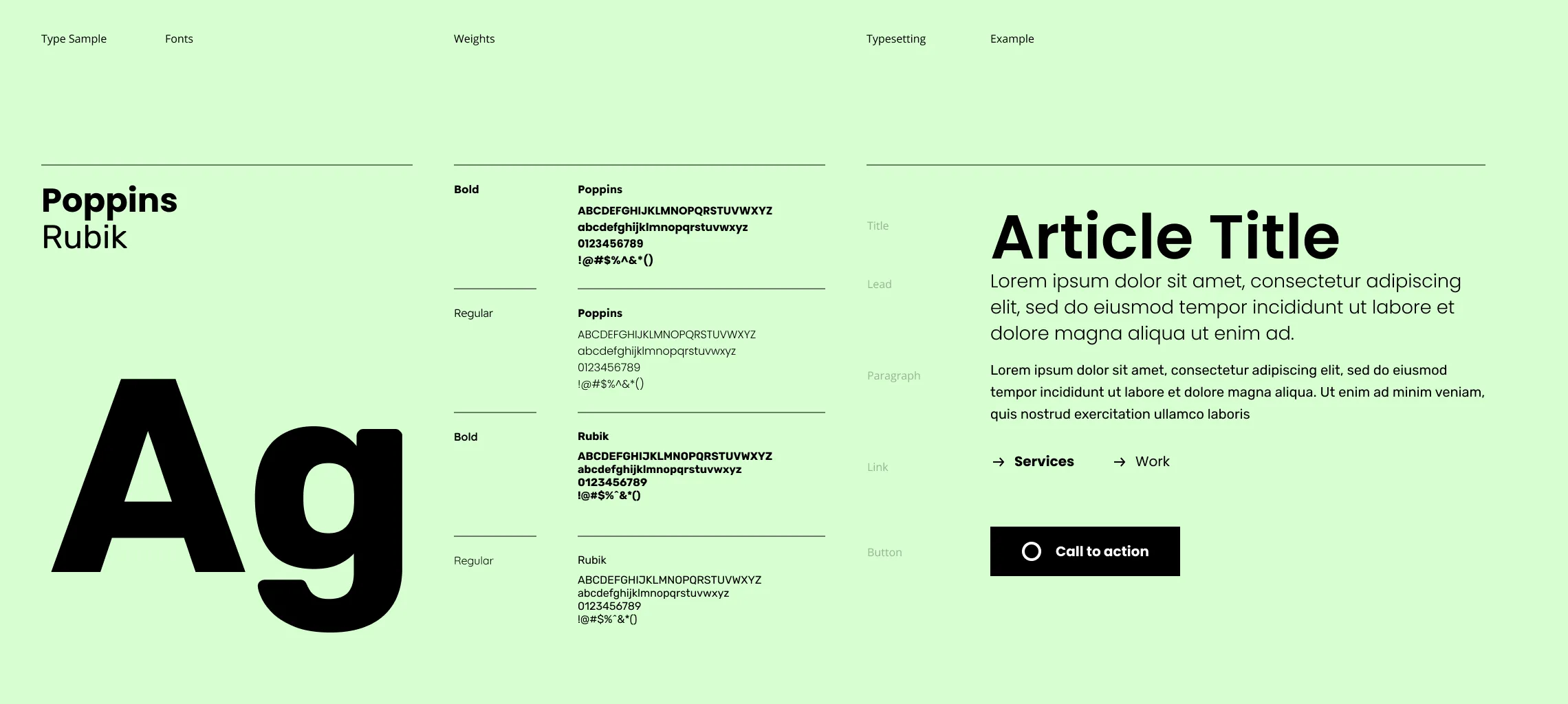
Poppins and Rubik were chosen as the primary fonts for the logo and the website. Poppins, with its clean and geometric lines, represents modernity and clarity, while Rubik adds a touch of friendliness and approachability. The color palette revolves around different shades of green, emphasizing the company's connection to nature and growth.

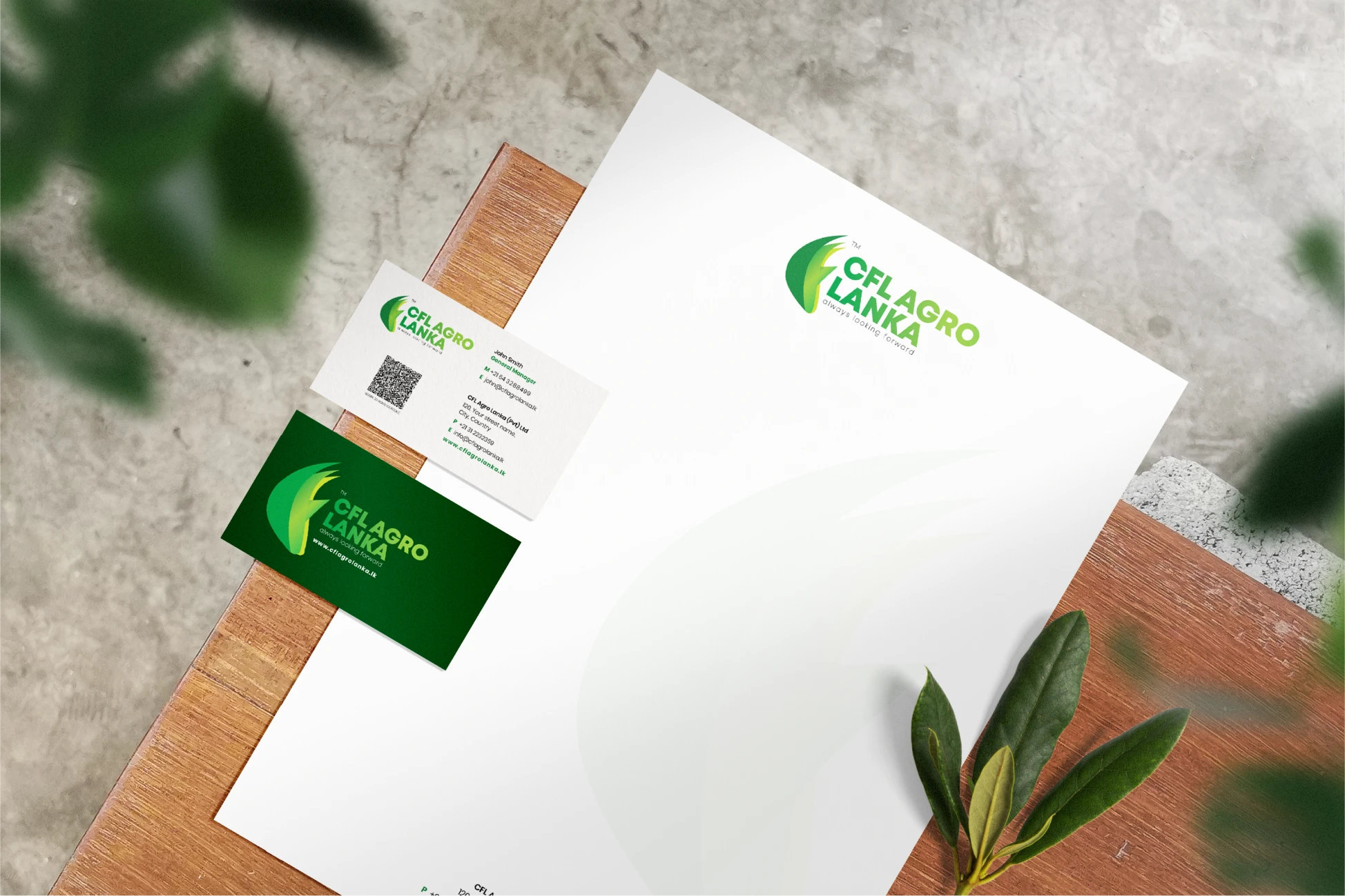
The business cards and letterheads were designed to align seamlessly with the new branding. Minimalist yet impactful, the stationery design ensures a professional and cohesive look across all touchpoints, enhancing brand recognition.
The website design process was driven by a deep understanding of CFL Agro Lanka's brand values, objectives, and target audience. The user-centric website was crafted considering the user journey, ensuring an intuitive and engaging experience. Designed in Figma and developed in WordPress utilizing JavaScript, CSS, and GSAP, the website is a perfect blend of aesthetic appeal and functionality.
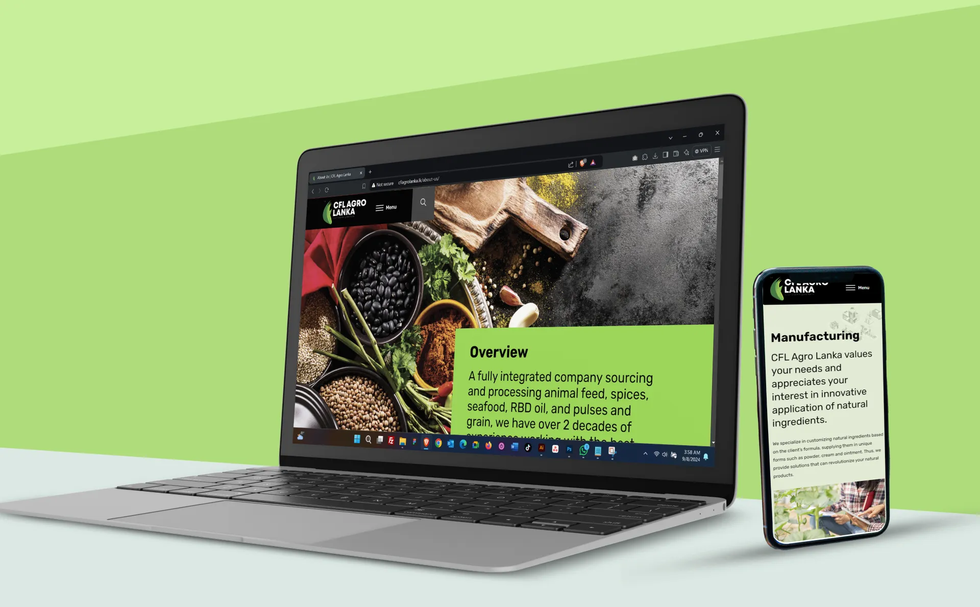
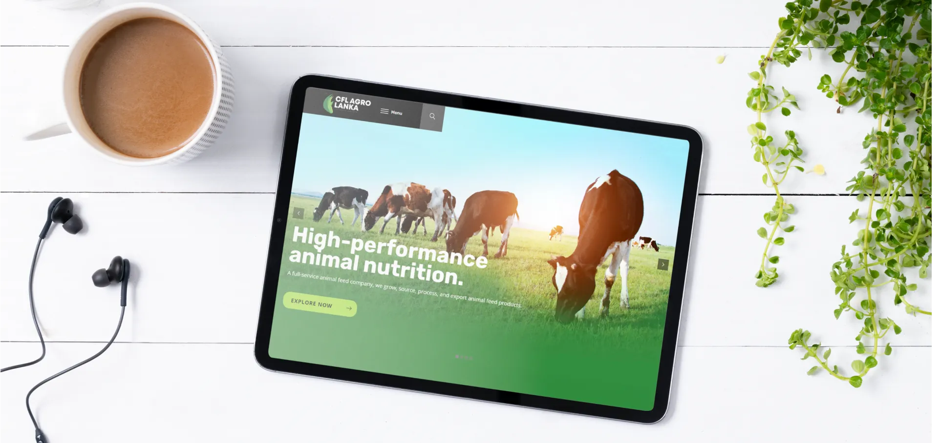
A key aspect of the website design was its responsiveness. Ensuring a seamless experience across all devices, the website was optimized for desktops, tablets, and mobile phones, reflecting the brand's commitment to accessibility and user satisfaction.
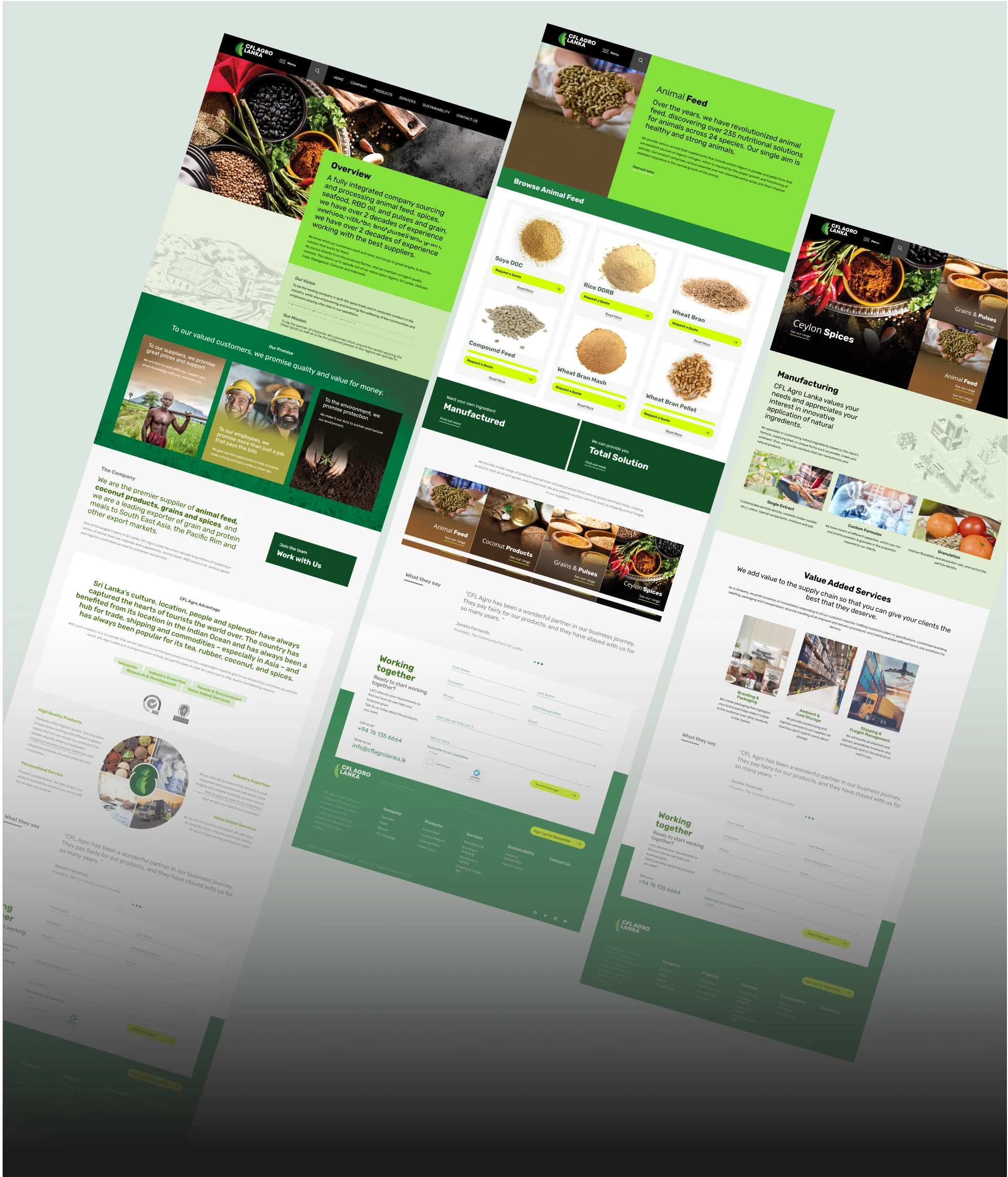
For CFL Agro Lanka’s rebranding, we utilized Figma for precise and collaborative design, and WordPress as the robust content management system for easy scalability. JavaScript and CSS were employed to create interactive elements, while GSAP (GreenSock Animation Platform) provided smooth animations, enhancing the user experience. These tools ensured a seamless and dynamic digital presence for the brand.

The rebranding project yielded outstanding results. CFL Agro Lanka witnessed significant improvements in brand recognition and customer engagement. Key performance indicators (KPIs) showed a remarkable increase in website traffic, user interaction, and customer inquiries, validating the success of the rebranding effort.